Mamiko Ikeda in Hand Lettered

IMG 1236

Fans of Denver artists’ Mamiko and Homare Ikeda will likely be delighted at Mamiko’s Couple in a Box series. The small boxes (measuring 8 x 3 x 3/4) contain two hand-drawn scrolls with story panels depicting various aspects of Mamiko and Homare’s daily routine. The short narratives are delightful and universally appealing. Crafted from paper, each hand painted with watercolor, the laminated boxes open matchbox style. Two scrolls of paper, sumi ink, bamboo picks and string are nestled inside. Each scroll and set is unique and sells for $50.

Mamiko Ikeda Hakoiri F fmt

Mamiko Ikeda Hakoiri  fmt1


Also on display are monoprints by Mamiko that effectively combine monotype printing with brush calligraphy. Each of these works convey the meditative aspect Mamiko approaches all creative endeavor with.

Mamiko Ikeda Niwa garde fmt

Born in Tokyo, Mamiko learned Japanese style calligraphy from her mother, Shotei Miur, a master calligrapher. Mamiko moved to Colorado in 1995 to study Native American culture, in particular their storytelling. Her interest in storytelling and manga animation are evident in the Couple in a Box series.


Online catalog here

Justin Quinn’s Epic E’s

IMG_1296

Justin Quinn’s works, based on Moby Dick, are on view at Abecedarian and will be through December 17. There is an online catalog here with a few details; I recommend viewing these works in person so if you are in the area and can come see the actual work I hope you make the effort – it is worthwhile.

My introduction to this work came via a gallery visitor describing this project to me – he said quite simply “Have you ever seen Justin Quinn’s work? He re-wrote Moby Dick using only the letter ‘E’” – What? I thought and probably said out loud . . . Quinn has indeed altered Melville’s epic novel by changing all the letters to the letter E, thus abstracting the text away from something that is read into something that is seen.

quinn_book_2

After viewing Justin’s work online I invited him exhibit some of this work at Abecedarian during the hand-lettered exhibition. He graciously agreed – what a treat it has been having the work here. I was quite simply not prepared for the elegance of this work.


IMG_1297

A project spanning five years, housed in  two cloth covered, hand bound books, the covers slightly stained and worn. What is inside is remarkable. Page after page of the letter E – in its capital form, a series of 3 marks made over and over and over again, in graphite, page upon page of meditations.
quinn_book_3

In Volume I, the traditional page layout of left to right, top to bottom. Personally, I am most charmed by the page numbers, title and table of contents pages.

IMG_1295

The second volume, Moby Dick Volume II or 174,649 times E, is more a suite of drawings, following its own logic rather than following traditional page layout. Quinn thinks of the process of producing this book as a collaboration between himself and Melville.

This set of volumes is accompanied by a wall installation of Volume II.  Photocopies of Moby Dick Volume II have been photocopied and its structure exploded. No longer a unique book that is viewed in an intimate way, it has been rendered in a limitless edition and viewable in a very public way.


Quinn wall 2 fmt

Also on view is The World over Nothing or 1,864 times E, an intaglio print version of a passage from Moby Dick, one that ponders the monotony and sublime sameness of existence, placed above a blank page spread. In some ways these intaglio plates look more like a book than a book does.


quinn_world_over_nothing_1

Both of the volumes are for sale individually or as a set. The entire photocopied versions are also available, as are individual pages. The intaglio print, in an edition of 6, is also available. Please contact me for details.

Jan Owen in Hand Lettered

Owen Each Day fmt

One of the first shows I curated at Abecedarian was one called Transparent/Opaque. Jan Owen (Belfast, Maine) was included in that exhibit. I’ve been curating her work into group shows ever since.


Jan is a featured artist in Hand Lettered, on view through December 17, 2011. Click here to link to her online catalog.


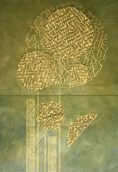
Jan’s calligraphic skill is remarkable, she has decades of hand-lettering experience. She is skillful at combining traditions in her field (the architectural blocks of early manuscripts for example), with aspects from other fields (as a musician herself, she understands rhythm as an integral part of calligraphic mark making), a love of poetry and literature (both traditions also rich with history and rhythm), and an ability to embrace traditional technique (18th century methods of creating patterns on paper) with materials of our era (she uses both Tyvek and Hollytek extensively). Her weaving of tinted Tyvek works particularly well for the seeds of Sunflower, pictured below.


Owen Sunflower detail


What I find most engaging about the works on view at Abecedarian is her use of well chosen texts alongside compositional and letter forming skill in a presentation that invites a viewer into an intimate viewing experience.  Many of her presentations are elegantly practical, such as her vertical accordion books that fold up nicely as books, that unfolded are installed as wall hangings.


Owen Audible Sound


In addition to richly painted surfaces providing background for her texts, Jan has started adding dimensional texture to these pieces, in the form of tinted and woven Tyvek. In other works Jan creates depth by layering Hollytex, a strong translucent synthetic.


Owen Brush Palimpsest fmt


My personal favorite in this exhibit is Brush Palimpsest, in part because it includes text by Octavio Paz. In this piece the many layers of translucent book pages add  depth while maintaining a sense of intimate quietude. Brush Palimpsest has been purchased by University of Miami, Otto G. Richter Library, Special Collections.


Owen Silence of the Ni fmt


She has taken the notion of layering to create layers of silence even further in the more recent piece Silence of the Night, a multi-layered wall hanging of translucent pages.

Hand Lettered

In this final show of the year, Abecedarian Gallery presents Hand Lettered, a group exhibition featuring artists whose works include hand lettered elements as either primary content or concept.

The book arts umbrella under which Abecedarian happily lives, includes a variety of mark making techniques. The use of letterpress is ongoing, ever more sophisticated and widely available digital processes have introduced production means to a broader range of artists than ever before. These days more writing is done digitally than with pen or pencil in hand.

A side effect of this that I consider unfortunate is that hand-lettered work is losing ground as a viable form of generating text. Hand calligraphy has given way to digital typesetting and thus seems quaint and archaic.

For Hand Lettered, I sought artists whose work makes use of the hand-drawn letter without calling too much attention to that fact. The artists in this exhibition have created works that transcend the tactic.
The exhibition features work by Heidi Zednik, Jan Owen, Justin Quinn and Mamiko Ikeda alongside books and sculptures by seventeen other artists from throughout the United States, Germany and Argentina.
Heidi Zednik is represented by Abecedarian Gallery and has been included in several previous exhibits. Here exhibited are several works created particularly for this exhibition. A dual citizen Austrian/American Zednik uses both painting and original texts in her works on paper, her studio work a recognition that art can be a catalyst for beauty, for peace and for being still.
Zednik atlantic fmt
Maine artist Jan Owen has also been included in previous exhibitions at Abecedarian. Captivated by the gestures found in handwritten letters, she often works with texts written by others. More than marks made on specific surfaces, Owen’s work integrates surface with mark, which she does by working on translucent materials that are layered, or by weaving materials back into the original surface.

Owen Sunflower detail fmt
New to Abecedarian is Justin Quinn, a printmaker currently living in St. Cloud, MN, displaying both books and prints from his Moby Dick series. Quinn has altered Melville’s epic novel by changing all letters to the letter E, thus abstracting the text away from something that is read into something that is seen. Both a bound copy of the original graphite drawings, and a photocopy version installed on the wall will be on view, alongside an intaglio print.Quinn world over nothi fmt

Also new to the gallery is Mamiko Ikeda. Born in Tokyo, Mamiko has lived in Colorado since 1995. She learned Japanese calligraphy from her mother, master calligrapher Shotei Miura. Here are exhibited several monotypes with calligraphy, works created as a form of meditation, the brush movements reflecting her moods, feelings and thoughts and hand painted boxes, each containing hand-lettered and printed manga scrolls.

Mamiko Ikeda Hakoiri  fmt1

Hand Lettered also includes artists’ books by the following artist:

Carol Erickson (Albuquerque, New Mexico)
Carol Es – (Los Angeles, Califronia)
Cheryl Bailey/Deborah Henson (Denver/Longmont, Colorado)
Danielle Feliciano (St Louis Park, Minnesota)
Elizabeth McKee (Pasadena, Maryland)
Ellen Wiener (Southold, New York)
Friedrich Kerksieck (Memphis, Tennessee)
Jennifer Hines (Chicago, Illinois)
Kristen Catlett – (Booneville, Arkansas)
Marí Emily Bohley (Dresden, Germany)
Marina Soria (Buenos Aires, Argentina)
Stephen Sidelinger – (Venice, Florida)
Sun Young Kang – (Bryn Mawr, Pennsylvania)
Susan Kapuscinski Gaylord (Newburyport, Massachusetts)
Turner Hilliker (Philadelphia, Pennsylvania)

As well as works by

E. Brooke Lanier (Philadelphia, Pennsylvania)
Connie Norman (Cheyenne, Wyoming)

Alicia Bailey, Gallery Director & Curator


Maria do Ceu Diel Paper, Paint and Travel

maria-wall-hangings

Paper, Paint and Travel  is an exhibition of current works by Brazilian artist Maria do Ceu Diel. Maria is a professor at Federal University of Minas Gerais, in Fine Arts. She has studied metal engraving and drawing, and admires and uses photography as part of her paintings. This exhibition is part of a large series of images created during study trips between 1998 and 2011 to Venice, Naples, Sicily and Taranto, in Italy. Places she refers to as  ‘places of the heart’.


Included are copper plate etchings and engravings from the rain series. Gestural and rich, these prints show a skill born of years landscape and figurative drawing.

DSC_4592

Also on display are prints from the Venezia series

DSC_4597

and several mixed-media works on paper

maria-photogroup-3

maria-photgroup-2

Look Again: Artists’ Books and Prints by Deborah Bryan

nine blocks

An exhibition of recent books and prints by Tennessee artist Deborah Bryan. Bryan is on faculty at Tusculum College, Greeneville, Tennessee. Ms Bryan’s work was first exhibited at Abecedarian during the RE: (rebound, recycled, repurposed, reused) exhibit when she was awarded the gallery director’s exhibition award. Her work for this exhibition involves using plates, whether copper or wood engraving, as covers or pages, and involves presenting prints in an alternative format.


On display are both prints and books; the books, although created from a medium usually associated with multiplicity, are not editioned but are one of a kind books, using retired copper plates and woodblocks.

portable art experience

Cercium


For me, the artist’s book provides an opportunity to present my work in a different      format, hence the title “Look Again.”  As a printmaker, I regularly find myself with a  completed edition and used, but beautiful, copper plates or endgrain maple blocks.  These matrices can become pages or covers.  Proofs can be recycled and  reconfigured as content for books.


Detritus series Indian PipesDetritus series Stems & Shreds

Big Draw Little Draw

Claire_Simon_nude fem back_1

Prompted by Quentin Blake’s question Where would we be without drawing? Abecedarian Gallery celebrates drawing throughout September with both an exhibition and a community drawing event. The exhibition “Little Draw: is an exhibition of 23 small scale drawings (sixteen inches maximum in any direction) by twenty artists from throughout the US. The selections were made by Dr. Gwen Chanzit, curator of Modern and Contemporary Art and the Herbert Bayer Collection & Archive at the Denver Art Museum. Below is Dr. Chanzit’s statement regarding this exhibit:

A juror’s primary responsibility is to select the strongest of the work submitted, without preconception or prejudice towards a particular style, or subject.  For me, this strength is determined by a combination of factors that may include technique, original concept, and/or strong composition.  Sometimes there is something indefinable that brings you back to look and to re-look. In making selections, I seek a wide spectrum of works of diverse media and style, each of which employs its medium in compelling ways. As one might expect of an exhibition of small scale drawings—there is a great variety here.  And that is all to the good.

Emily_Martin_4446 Steps_1

Compelling work has no boundaries or regimen; it may be realistic, abstract, serious, humorous, self referential or contextual, of a singular medium or mixed media, and it may be functional or not.  In the case of this project, the submissions were appropriately varied: some are delicate, others bold; some crisply graphic in quality, others more textural, some celebrate the polychrome, others stick to grisaille; and some expand into the “all over,” while others remain contained.

Donald Fodness i-on

Works on paper have a special appeal because of their directness—one gets a glimpse of an artist’s unfettered self, without the overlays that sometime accompany large format or laboriously worked compositions.  Happily, there was no formula for either the making of this work, or for its evaluation.  The submissions are diverse in style and high in quality.  This work’s validity goes beyond the parameters of any competition guidelines—quality art shows itself, without fail. I look forward to seeing these drawings in concert with each other, exhibited in a single space, for all to enjoy.


Included in the exhibition are works by Ashley L Schick, Bill Lowrey, Celina Grigore, Cheri Buxman, Cheryl Bailey, Claire Simon, Donald Fodness, Ellen M Harper, Emily Martin, Fatima Jamil Faiz, Gayle Gerson, Jason Lee Gimbel, Jen Urso, Jennifer Fox, Jenny Wiener, Michael Bernhardt, Michael Good, Sara Sanderson, Seth Roby and Susan J Thompson.

Click here to see an online exhibition of the catalog; print or PDF versions of the catalog can be purchased here.


Susan Collard

Susan Collard History 2

I met Susan Collard years ago during a Tim Ely workshop in eastern Washington. I became and remain a steadfast admirer of her work in the book arts field. We seem to be cut from similar cloth, she and I – intelligent, quirky introverts whose lives are constructed around  working with objects, words, thought and their interplay. So I always look forward to conversations with her an any variety of subjects and recognize my good fortune in being able to exhibit her work from time to time. Her work is now featured in Interactive Artifact at Abecedarian Gallery.


Susan is an architect (with an MFA in poetry), working out of her home in Portland, Oregon. Her many-layered book works are intricate, interactive and sculptural. As an architect, Susan has an awareness not only of the physical properties of objects but of how those properties and relationships shift with the movement of the objects themselves, their environment and the other objects and beings (including viewers) in proximity.

Susan Collard Nested 1As an artist Susan understands the myriad stances a viewer might take when approaching a work whether for the first time or on a return visit. An intelligent selection of forms and objects that are the result of much thinking before hand separates these works from what is so often found in contemporary assemblage/collage works. 
As a student and lover of the written word, Susan’s text are pithy and elegant. Propelled by this language Susan devised a phonetic alphabet devised from forms based on the early Celtic alphabet, Ogham which is used in 3×3. Nested, a book embodying the theme ‘secrets and lies’ also uses encrypted texts from one of her poems.

Susan Collard Nested 2

In Susan’s words:
I often describe my books as “constructed” rather than bound. I am drawn to materials and formats that demand structural ingenuity, and I often tinker with a book’s form as I go along. Wood, metal and glass have completely different virtues and limitations than paper, and much of what I do falls outside traditional bookmaking techniques. That said, I am very much attached to the book as a kinetic object — one that can be opened, studied, looked at, read—and not simply a closed sculptural piece that is made from books or trades on our ideas of bookness. I trust that each reader will have a unique, intimate experience exploring the book, and hopefully find in it an open-endedness and complexity that is not exhausted by a single viewing.

Collard b g
In 2005 I included Susan’s work in a curated exhibition in which I invited 9 other bookbinders/artists working in the book format to create an object using a volume from the Boys and Girls Bookshelf, a 10-volume set published in 1912. Susan chose Volume 1: Fun and Thought for Little Folk. She opted to do little to the outside of the book so a viewer really has little idea what enticements await. While this can be true of any book (hence the adage about judging a book by its cover) the contents of this one are particularly rewarding. This tendency to be inspired by the outside, or by the title, of a cover, and letting that inspiration take her down various paths of thought and research is a continuing aspect of her work, as is her love of distilling a volume into a piece that hints not at what she sees in the original but what she would have liked to see.

Susan Collard GreatCities 2

Another altered book, Work in Great Cities, started when Susan found this book at a flea market. Once home she experienced a bit of remorse because, other than the title, the work held little interest. But she did appreciate the confident and expansive title and went ahead and worked with it, imagining the book as a set of urban building blocks. A strong element to the work are the tiles and blokes created from cut-down printing plates. Fragmented and moveable, these elements evoke the built elements and history of cities.

Since that time Susan has been honing her skills and expanding her collection of artifacts to select from. Her work consistently includes collaged objects that take shape from an ever growing trove of found materials. It is obvious from examination that these works involve considerable time to create; what is less obvious is the amount of thinking that goes into the selection and handling of every included object.

Susan Collard AnchorInn 2A variation from this method is apparent in You Won’t See Me At the Anchor Inn. Although made from more conventional materials it, too, is a structural experiment, which turns a flat 9×12 collage into a small pop-up book which, fully unfolded in a meander format, betrays its single-sheet origins.


In Susan’s words

I think of this work as adhering to William Carlos Williams’ dictum “no ideas but in things.” I am at my happiest and most creative when surrounded by an unruly collection of prosaic and obsolete objects, each with their own unknowable histories, calling out to be rescued from oblivion. With this staggering abundance of possibilities, my first and most important decisions center on what will be left out. With each book, early choices restricting sources, content, scale and materials make it possible to move forward, and ensure that each book has its own distinctive character.

Click here to view the online catalog of currently available works.

Music Bo(o)x exhibition in the Reading Room

Music and art. Music and books.

curated by Lynn Sures and John Risseeuw

Duke ellington fmt

above: Duke Ellington by James Todd


on display in Abecedarian Gallery’s Reading Room, Denver, CO  US through August 6


on online here: http://bit.ly/jCzHLw


Several years ago, Lynn Sures and John Risseeuw realized that they both had created artist’s books based on jazz artists and compositions. Lynn’s VARIATIONS on the Dialectic between Mingus and Pithecanthropus erectus responded to the seminal work by Charlie Mingus and John’s TM

was a tribute to Thelonious Monk and his song Thelonious. John’s Modal is a response to Miles Davis’ classic Kind of Blue album. John also had prints on Monk, Gillespie, and other jazz greats, so they mused on having an exhibition of artist’s books and prints solely based on jazz and blues.


In Spring of 2010, the 87 Florida Gallery in Washington, DC, agreed to host such an exhibit and soon like-minded artists were located, the gallery contracted a local jazz band for the opening, and the first Music Bo(o)x exhibition was held to great reviews and reception.


It was not possible to tour the exhibit immediately and the work was sent back to the artists at its conclusion. But now a new and enlarged show has been selected. This time, the work chosen has been expanded to include books and prints inspired by other musical forms in addition to jazz and blues. Six of the original 10 artists were able to show work again, along with 5 additional artists.


This is a most engaging exhibit, especially for the music lover. Visual art and book work, responding to music and making the aural visual. You’ll see woodcut portraits of jazz musicians, lost in improvisation, by James Todd. You’ll be All Shook Up with Elvis in Karen Hanmer’s book of the same name. Ed Colker and Dave Brubeck actually collaborated on Open the Gates in which Colker responded to Brubeck’s music The Gates of Justice. Lynn Sures made pulp-painted, watermarked and printed paper in response to her immersion in Mingus’ Pithecanthropus erectus to interweave with the text of Rick Potts. Robin Price’s beautiful tribute to the classical guitar of Pepé Romero is an award winner. John Risseeuw has combined his distinct handmade papers, intuitive placements of text and image, and lifelong passion for the music to bring fusion and astute observation to his books and prints. Intricately hand-cut, strongly-colored papers arrive at an exuberant tempo played out in cj grossman’s cascading accordion book Morning Jazz. Barb Tetenbaum used her characteristically innovative letterpress technique to illuminate the musical score for four voices in Gymnopaedia No. 4. Don Anderson, late UW-Madison professor, spent a sabbatical year listening to jazz and drawing portraits of the performers. Mary Hark’s beautiful boxed portfolio with books and CD honors the extraordinary work of Ghanian palm wine musician Koo Nimo. And Steve Prince’s vivid, alive drawing/relief style puts us in touch with issues as well as the music.

Dolph Smith in Interactive Artifact


Smith Fire Pole _1

For those of us already familiar with the work of Dolph Smith, our first introduction to his work may have been when it was featured in (and on the cover of) The Penland Book of Handmade Books published by Lark in 2004. Or perhaps we have lucky enough to have taken a class from Dolph at one of the many workshop centers he teaches at each year. Or perhaps we have had the pleasure of exhibiting side by side with Dolph. Or had the honor of exhibiting his work. I have had the great fortune to have experienced all of the above.


One of the best things about knowing Dolph is having the opportunity to introduce his work others. Such pleasures are the driving force behind many of my curatorial efforts. So it is with great delight that I once again feature Dolph’s work at Abecedarian Gallery, this time in Interactive Artifact, which is on display through August 6.


His work is sheer delight, filled with humor and the wisdom that comes from decades of working with objects, of going to the studio and making things.


Details about the work of Dolph’s currently on display can be seen here: http://bit.ly/iTtFJu